The premier men's professional golf tour in Europe, operating globally with a diverse schedule of high-profile tournaments.
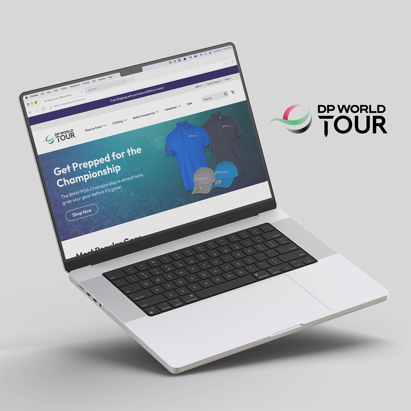
Through my employer, I was given the opportunity to participate in a homepage redesign project for the DP World Tour Official Store, an online e-commerce website. The homepage was redesigned for both mobile and desktop platforms using Figma.
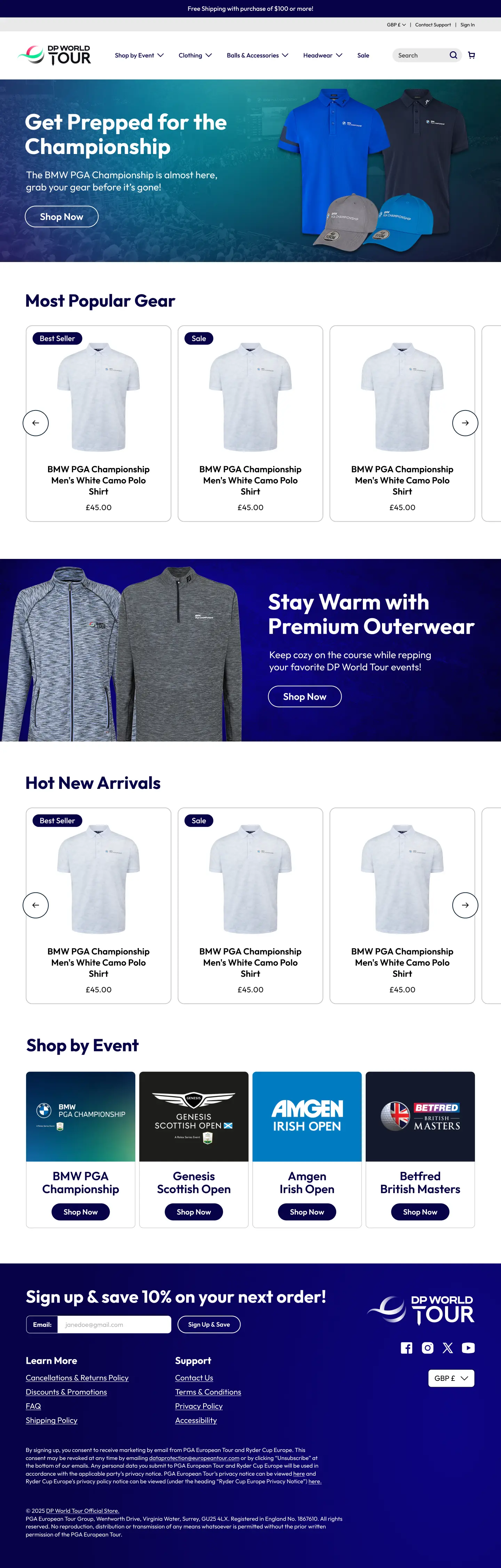
The DP World Tour Official Store homepage was in need of a redesign, as it suffered from numerous usability issues leading to a poor user experience.
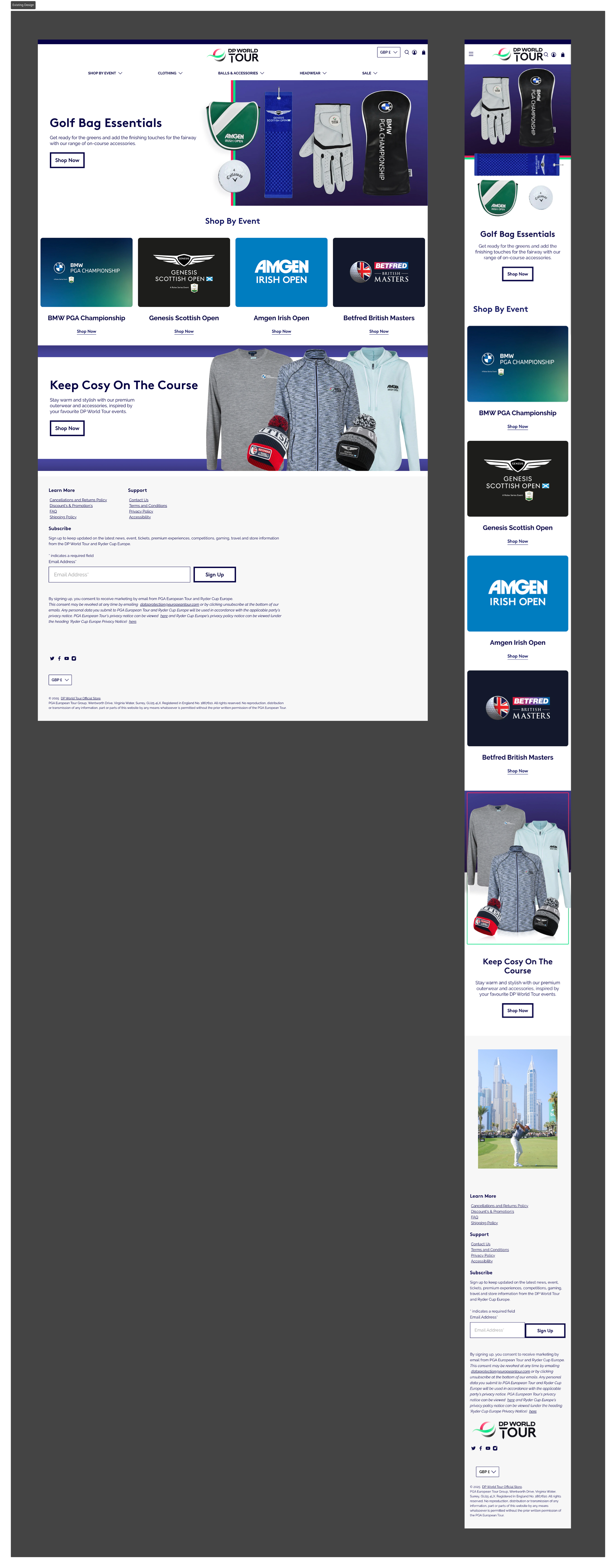
Additionally, the existing design did not include the flexibility to highlight upcoming and ongoing events, and instead promoted all events equally year-round. This design did not take into account that the website’s traffic is heavily seasonal due to anticipation for specific events, and there was an opportunity to better promote merchandise during those periods and increase sales from the brand’s target audience.
The design solution corrects many of the usability issues found in the heuristic markup and evaluation. Additionally, it includes added flexibility to highlight particular events, which allows for more targeted product promotion.
To kick off the project, I collected as much information as possible to gain an understanding of the brand and its target audience.
I learned that the customer base for DP World Tour is dominantly male and consists of golf enthusiasts. The majority of customers tend to engage around a particular event and purchase merchandise on the website to wear to the event, or to wear after the event to commemorate the experience. For that reason, the website traffic is heavily seasonal around the time of a specific event taking place.
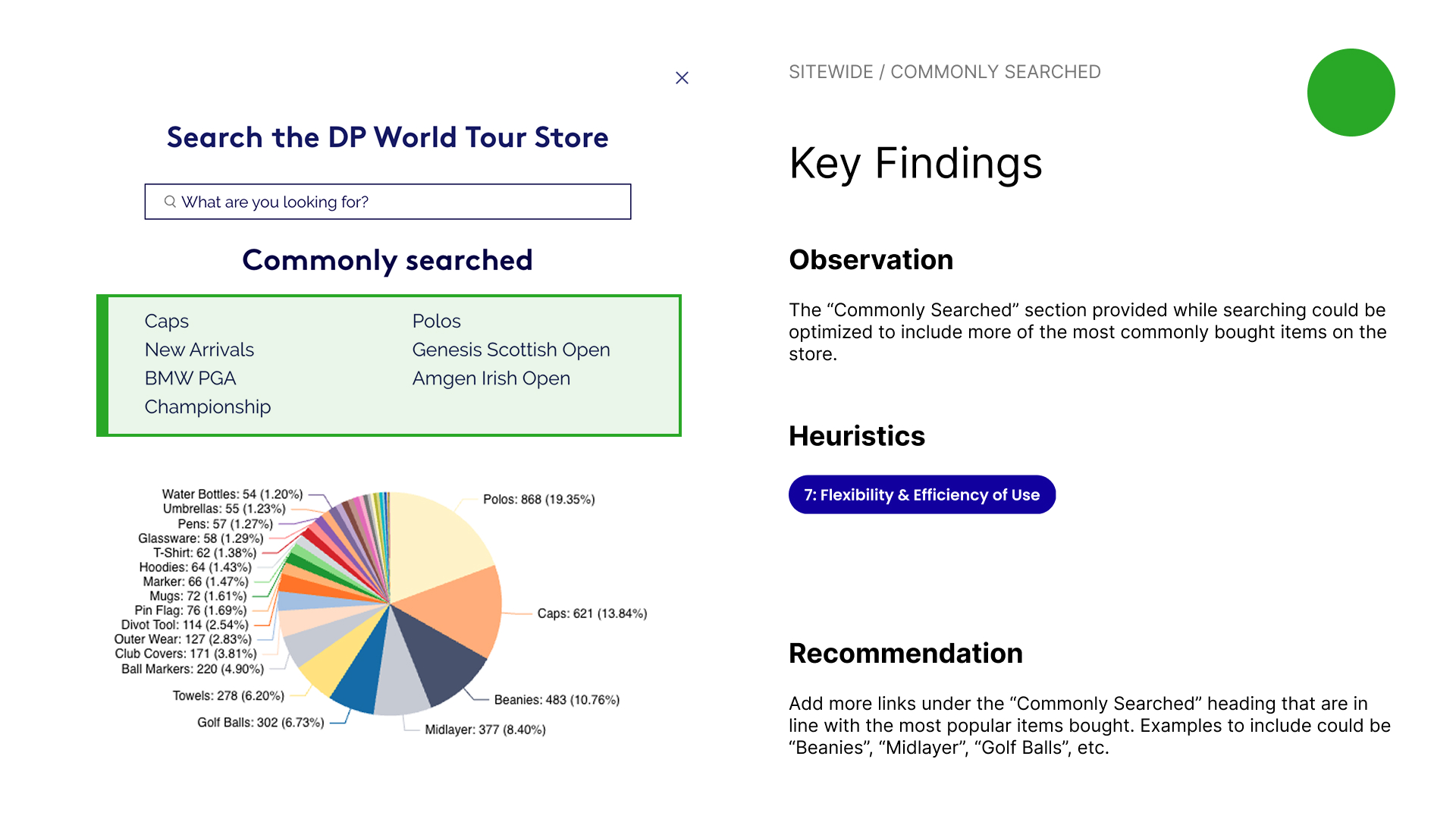
I also received existing sales data for the top products sold on the current website. Since the majority of customers are searching for these products, the website layout and information architecture should be adjusted to make finding them easier.
.jpg)
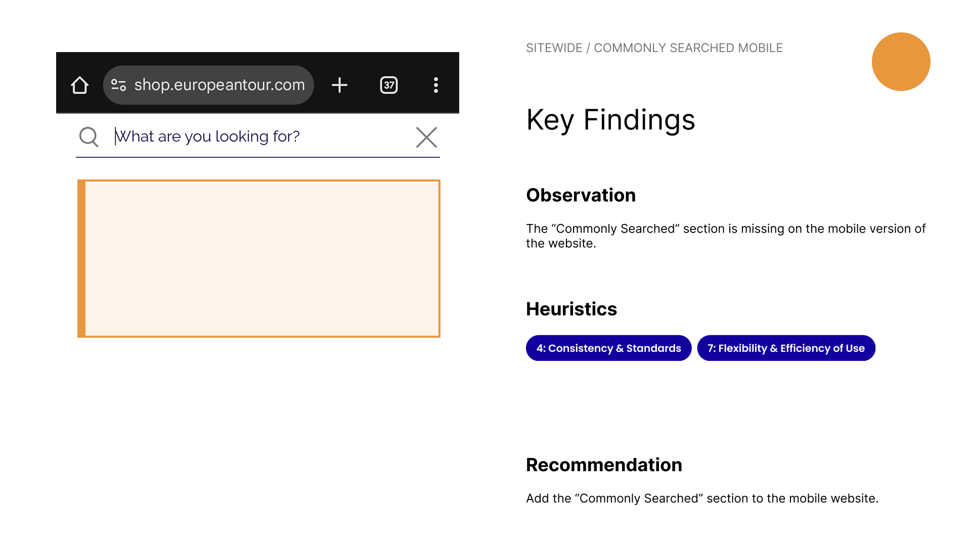
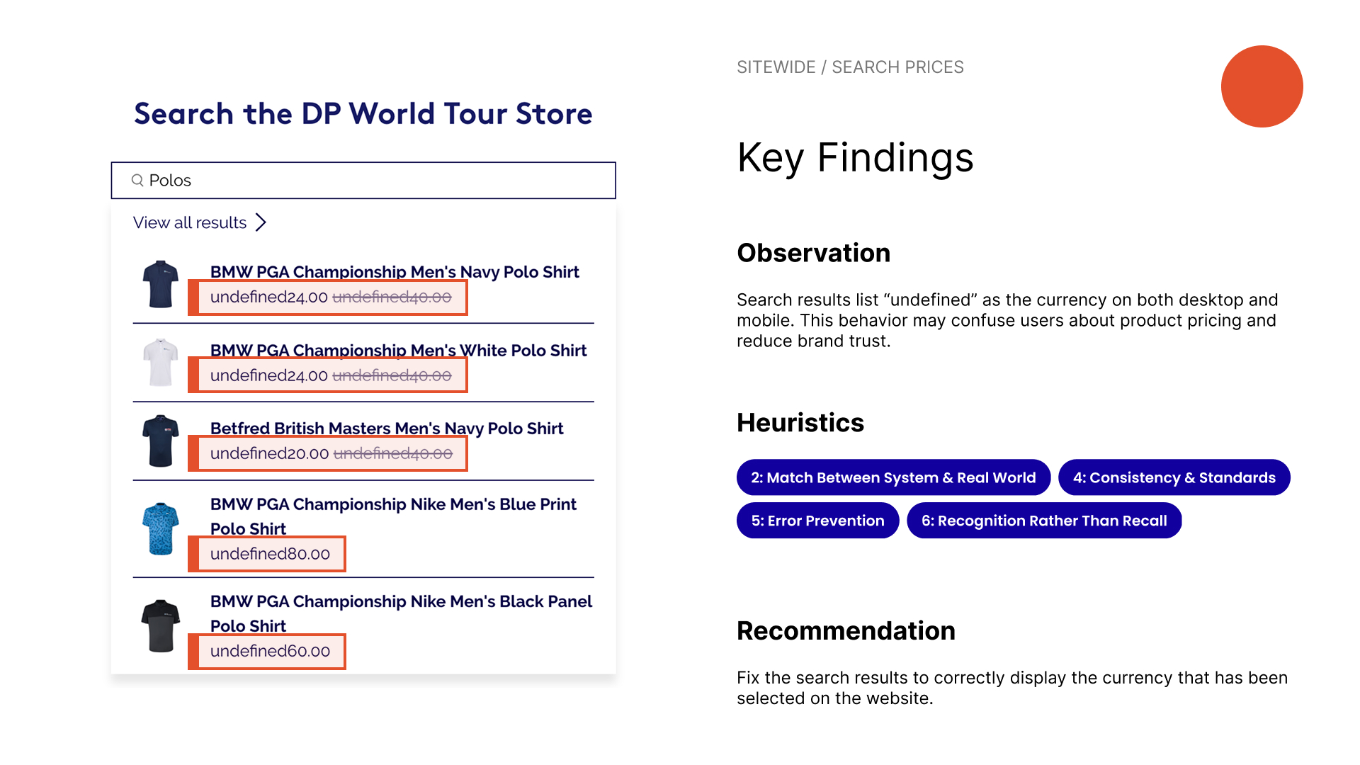
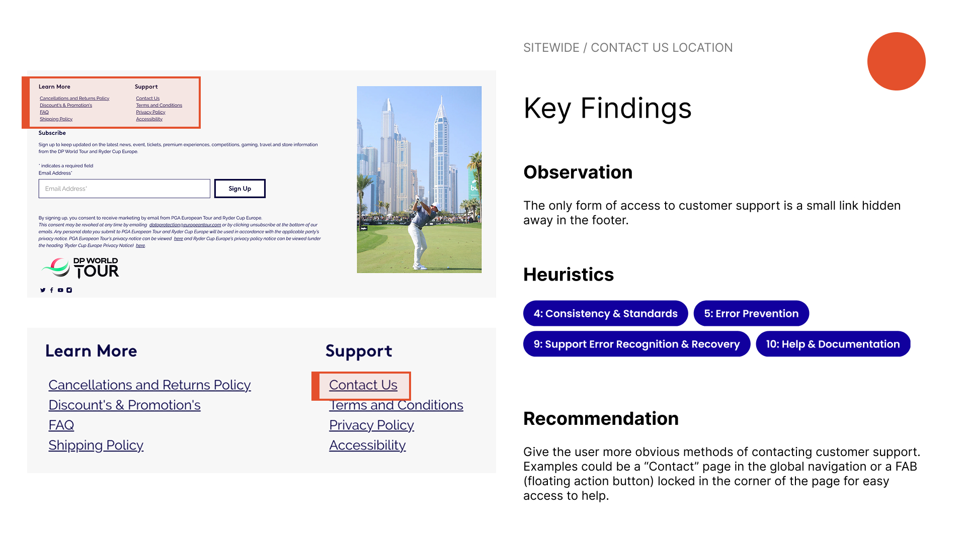
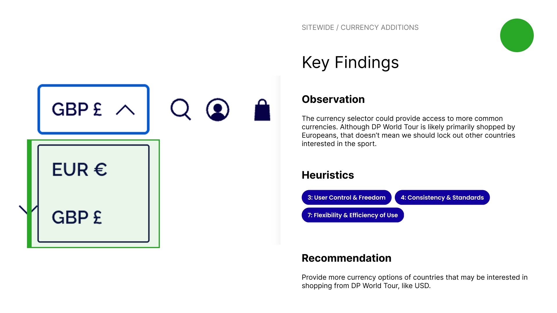
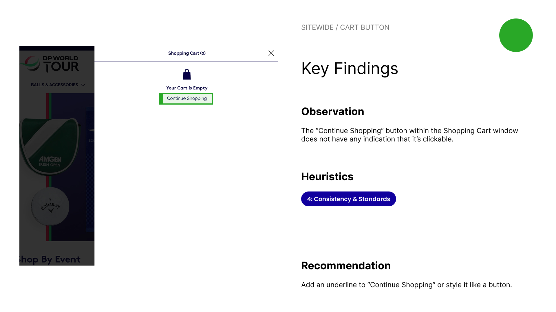
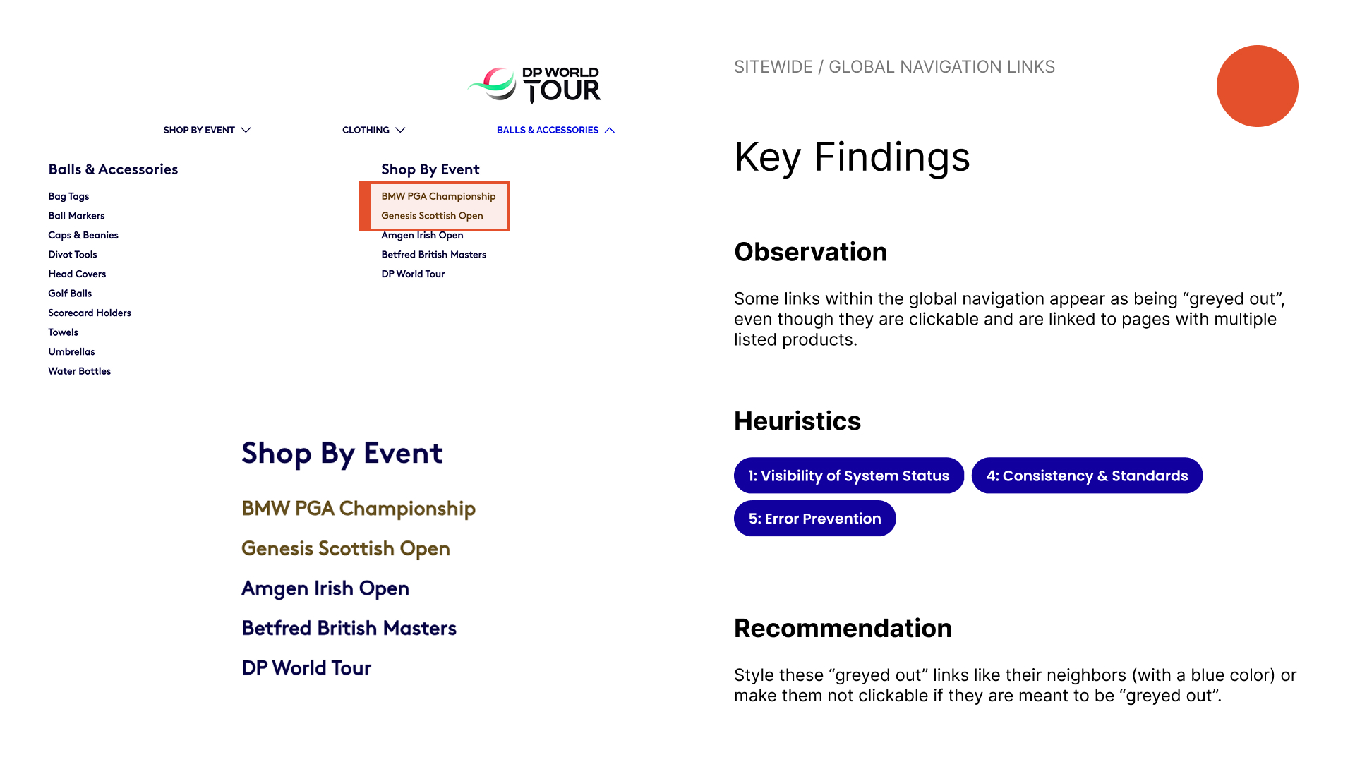
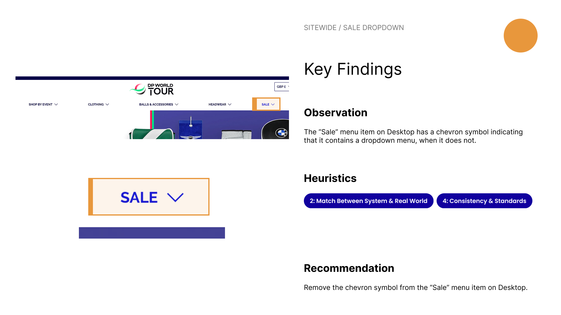
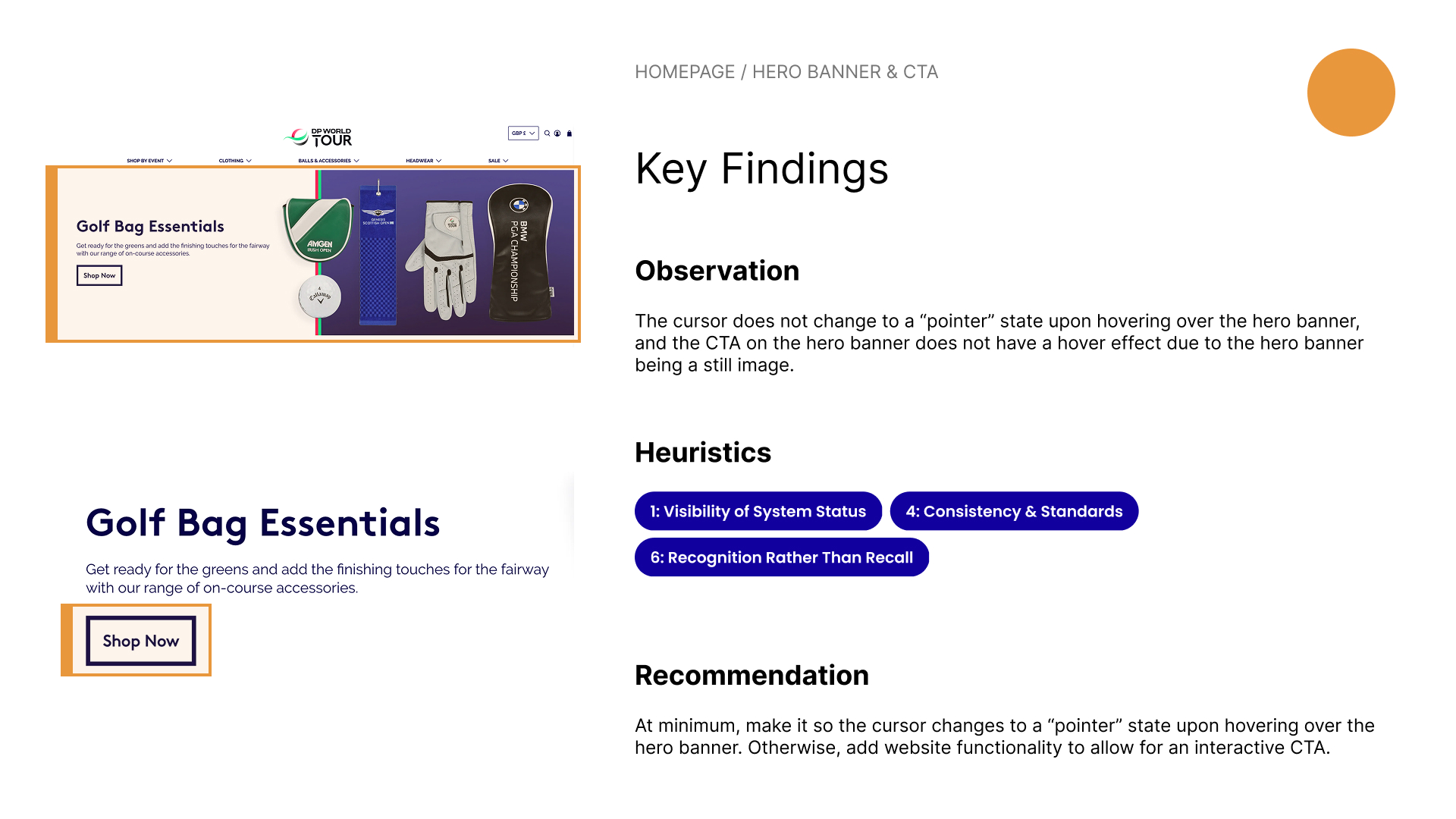
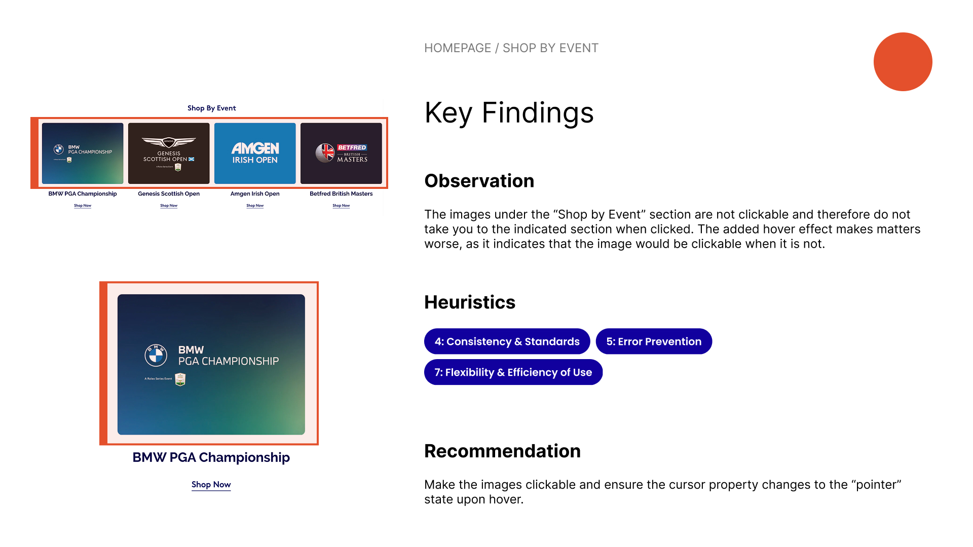
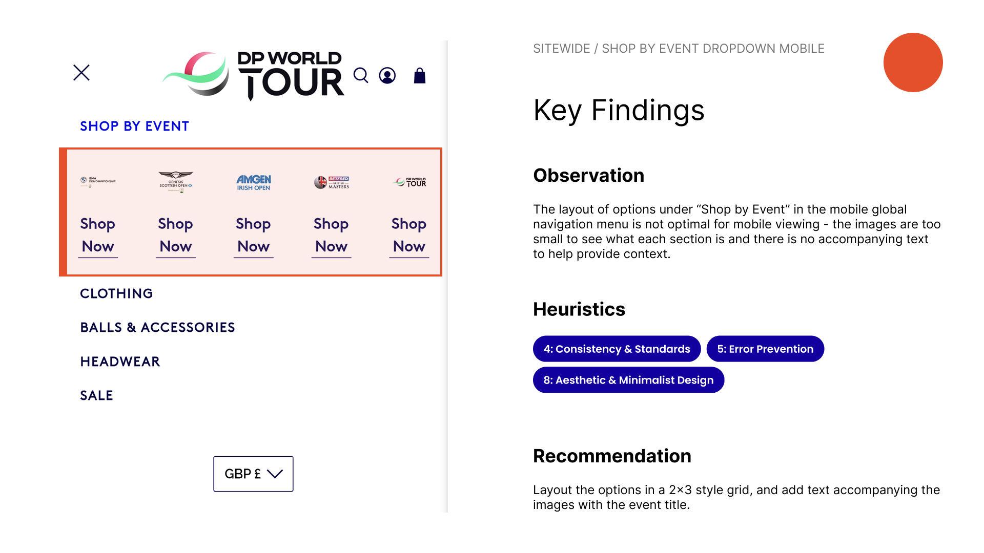
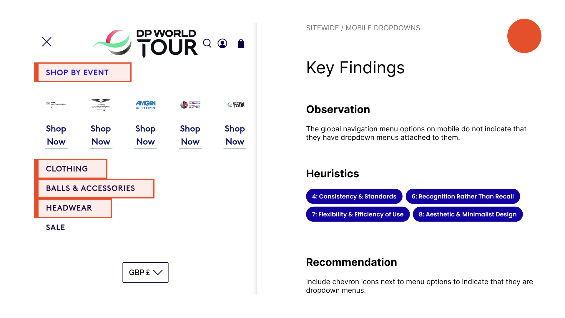
I conducted a heuristic markup to quickly evaluate the existing homepage design and assess where improvements can be made. During the markup, I adopted the persona of the typical customer based on the previous findings and attempted to view the website from their perspective.
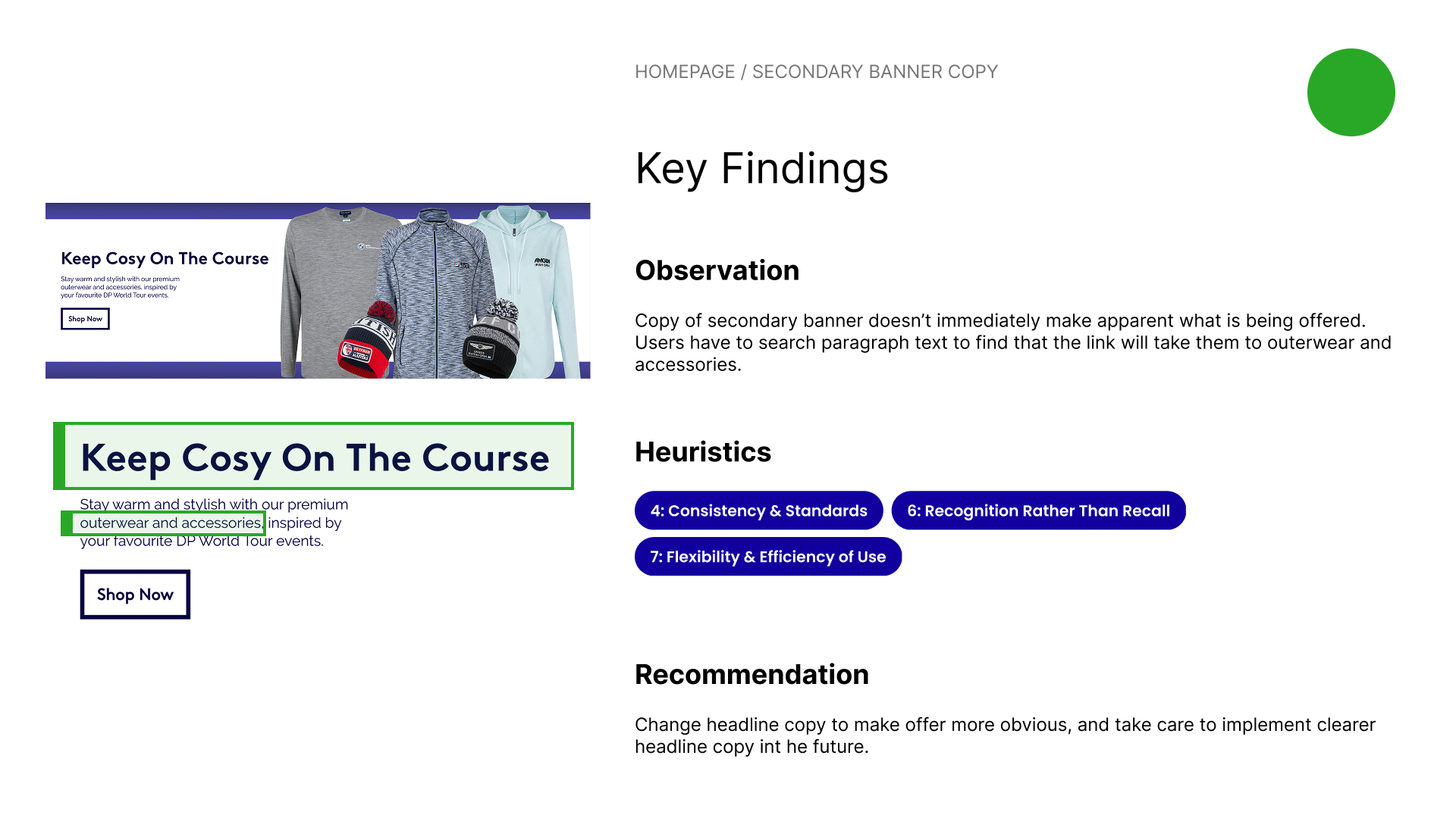
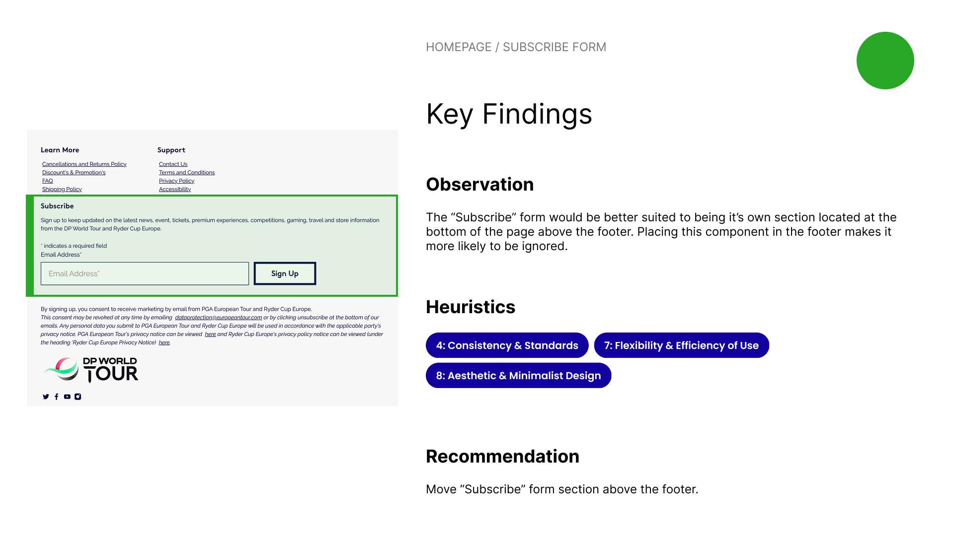
Using this research method, I identified a number of usability issues including sections with hover effects that indicate that they are clickable when they are not, an abundant lack of affordances from clickable links that don’t change the cursor state to a “pointer” to buttons that appear to be “greyed out” although they are active, and product badges with a low text-to-background contrast ratio.
After the heuristic markup, I analyzed the existing homepage deeper and compiled all of my findings into an in-depth heuristic evaluation, where I documented any usability concerns found and compared them against Jakob Nielsen’s 10 Usability Heuristics for User Interface Design, a common checklist used for assessing the usability of products.
After creating a comprehensive list of all the existing homepage’s issues, I was ready to begin designing a potential solution that would address them.

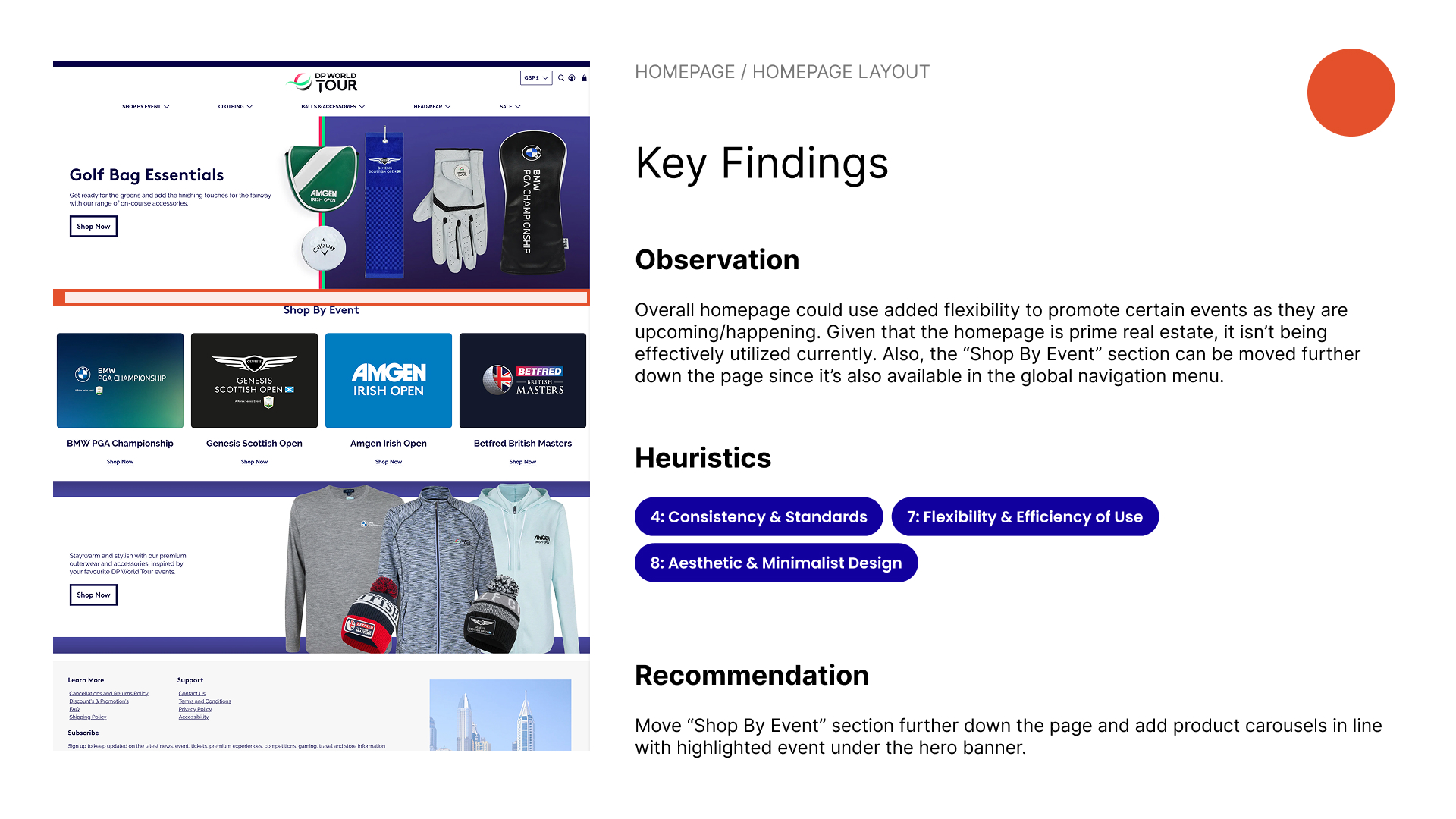
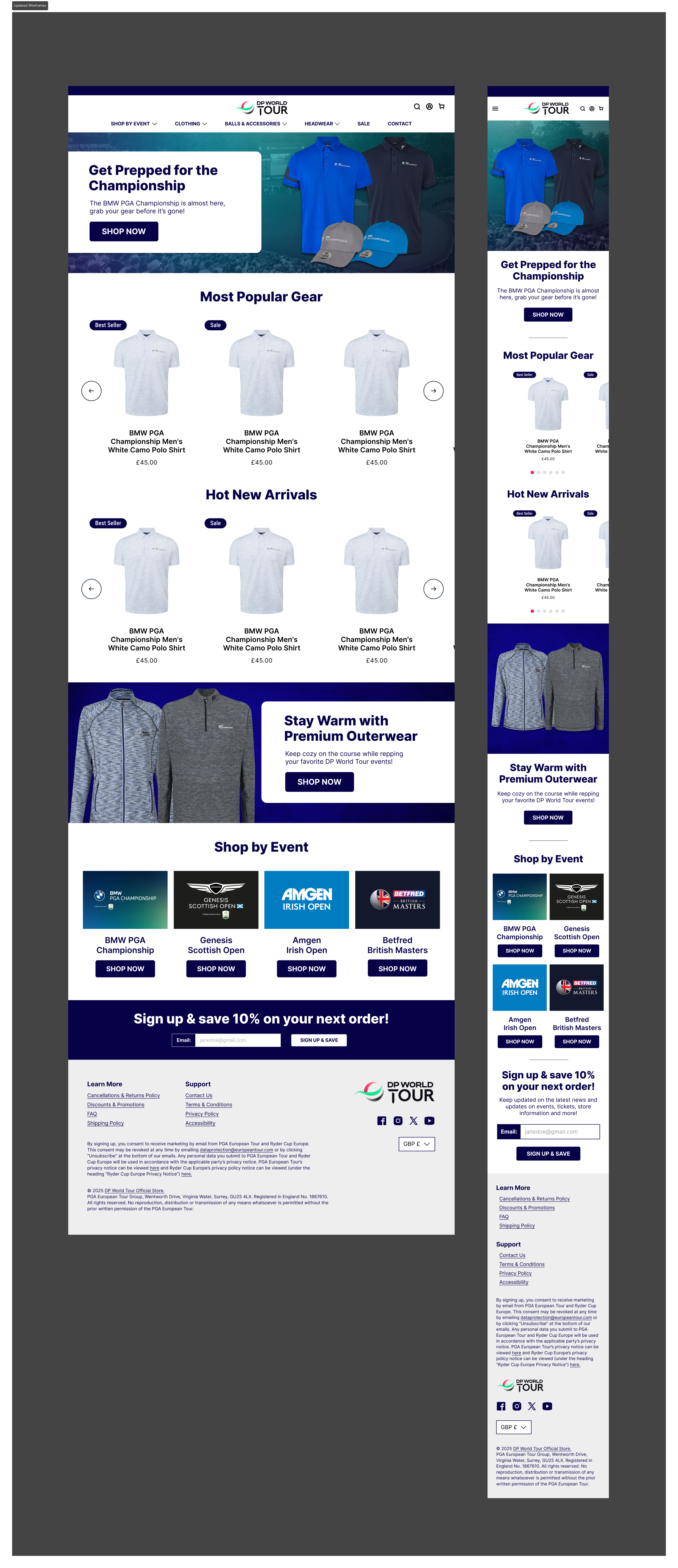
After discovering areas of improvement, I created a draft design in the form of two high-fidelity mockups for desktop and mobile platforms.
This design attempted to solve a majority of the most prominent usability issues found. The most significant change with the new design was added flexibility to include product carousels on the homepage, with the intended effect to promote high-demand product during peak traffic periods.
I believed this update should theoretically increase conversion rates, because now visitors would engage with high-interest products as soon as they hit the homepage, rather than after a few clicks.
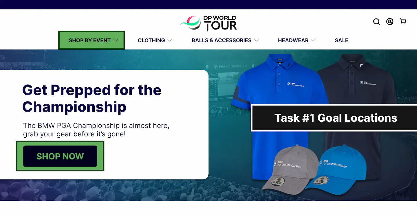
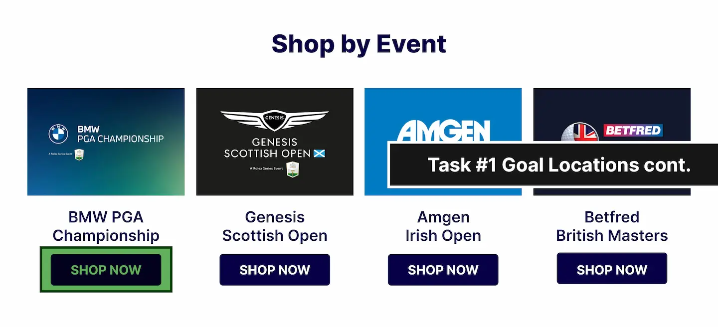
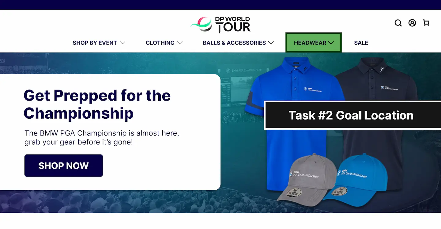
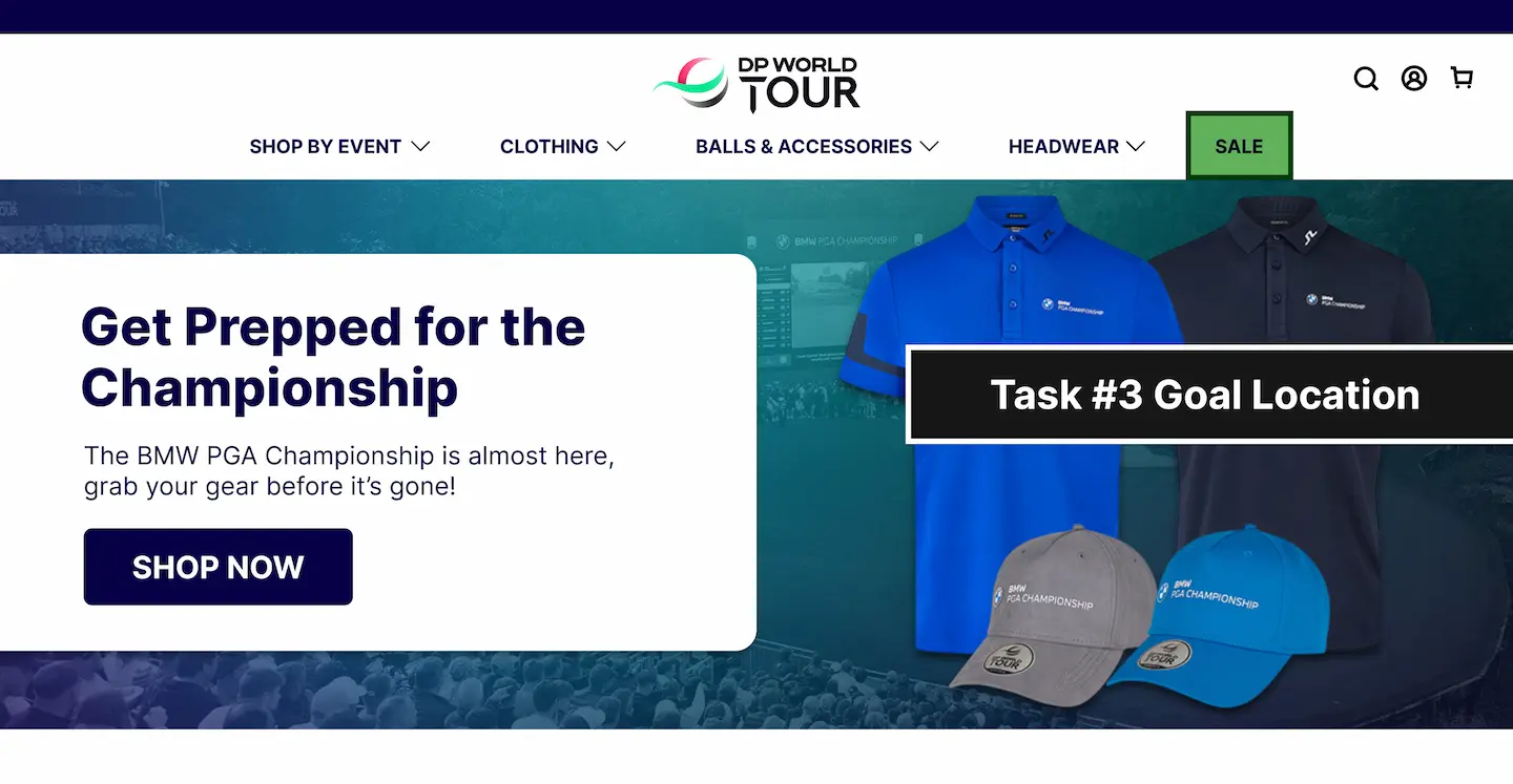
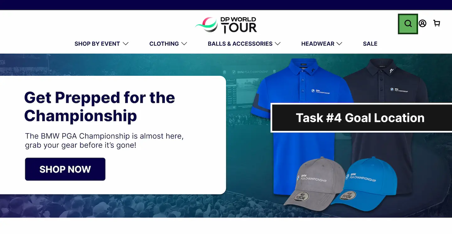
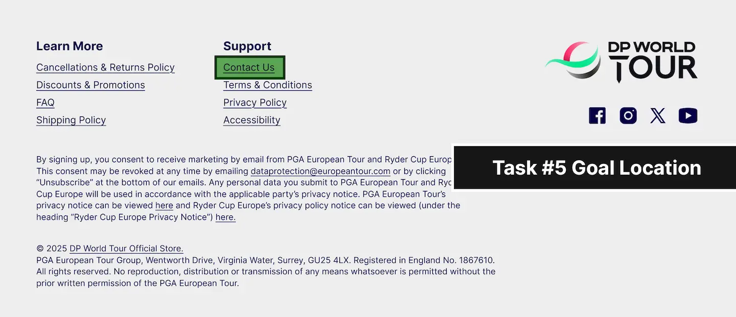
After creating the mockups of the new homepage, I created a user testing protocol with the intention of testing the new design. The test consisted of five tasks that would provide insight into whether or not the average user would be able to use the webpage effectively.
These tasks assessed if the user could:
1. Locate where to shop for merchandise of a specific DP World Tour event.
2. Locate where to shop specifically for headwear.
3. Locate where to shop for items that are on sale.
4. Locate where to search for a specific item using the search functionality.
5. Locate where to contact customer service.
Following the creation of the user testing protocol, I performed the test on 10 participants ranging heavily in terms of age, brand knowledge, sport knowledge, and technology familiarity.
After testing, I compiled the data from the tests into a series of graphs to visualize the participants' time on task and number of errors for each task.
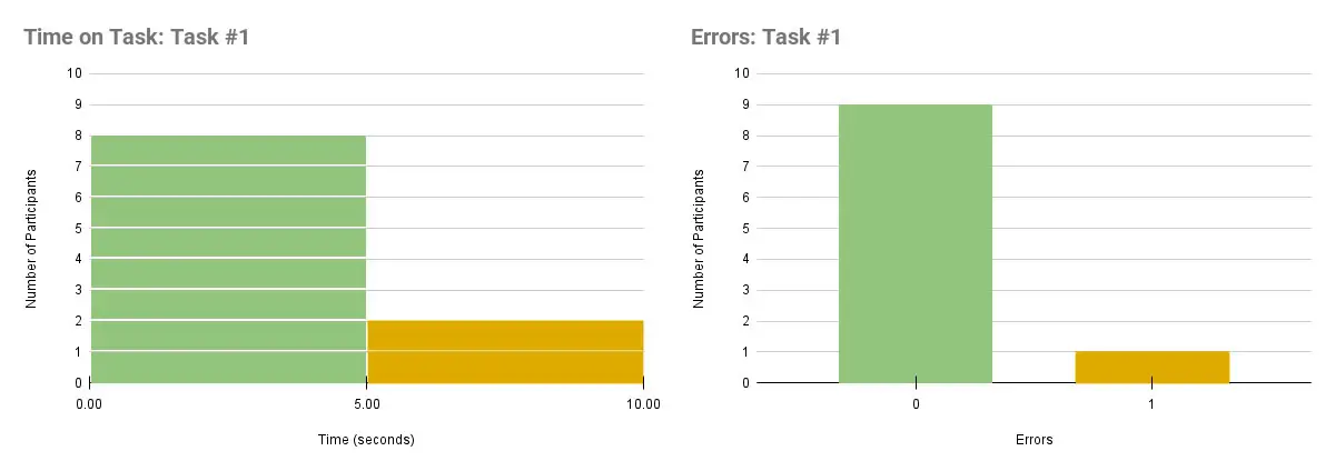
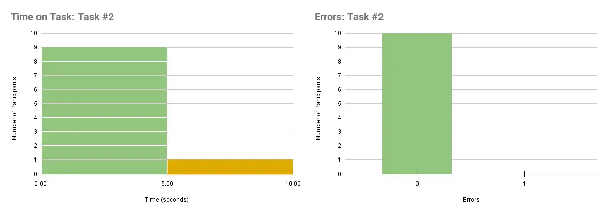
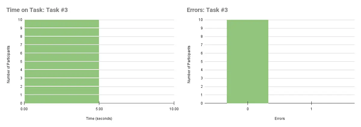

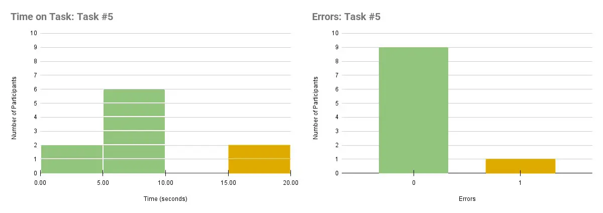
The data indicated that most participants were able to complete each task with relative ease, with the exception of the fifth task. While most participants were able to find the link in the footer for contacting customer service, it took many of them a considerable amount of time.
Some participants also mistook the "Account" button in the top-right corner of the page to be a way of contacting customer support.
With these findings as well as a recommendation from one of the participants, I decided to add an additional method for contacting customer service on the top of the page in the final design. I also changed the "Account" icon into a smaller and clearer link that reads "Sign In".
The final design corrects discovered usability issues and allows for targeted product promotion during certain events. Additionally, it subjectively represents the brand better from an aesthetic standpoint.

After the completion of this design, it was taken to the development team at Legends Global to be built. After the new homepage was launched, we saw a revenue boost by $15k the following quarter, which can be directly attributed to the improved user experience.
With this project, I learned how to effectively write user testing tasks. I felt that the tasks I prepared for participants could have been worded in a less-confusing way, and next time I will initially run my questions by others to gauge their clarity.
Additionally, I learned how to effectively conduct a user test with real users. For this project, I felt a pain point was having the participants perform the user test on my laptop with the trackpad. I hadn't considered that individuals may struggle with using a trackpad, and in the future, I will take further consideration before the testing phase to provide the correct equipment (like a mouse).
Lastly, while I'm happy with how the testing went, I felt that creating more robust prototypes with multiple screens would be a more realistic experience for the tester and would return more insightful data.
