A ticketing app for a collection of entertainment venues located in downtown Phoenix.

Mood is a club in downtown Phoenix that has been around for 20 years, and was renovated into a 1100-person capacity concert venue about 10 years ago. The renovation was such a great success that it allowed Mood to open two other clubs over the last few years - one in Glendale (Mood Westgate) and one in Tempe (Mood on Mill). The owner Chris hired me to design a mobile app that allows patrons to purchase tickets to events at all three locations.
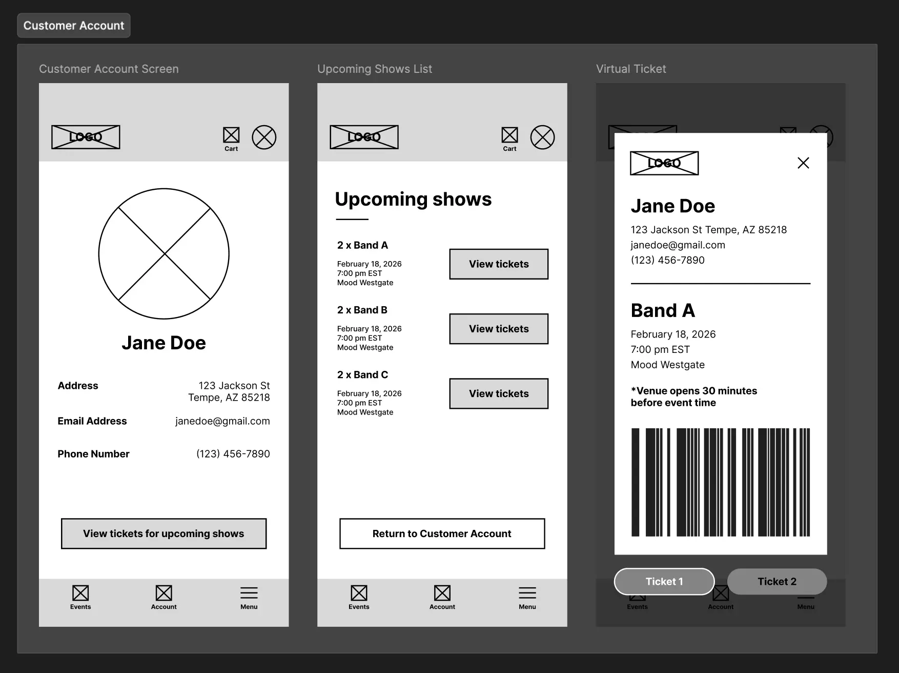
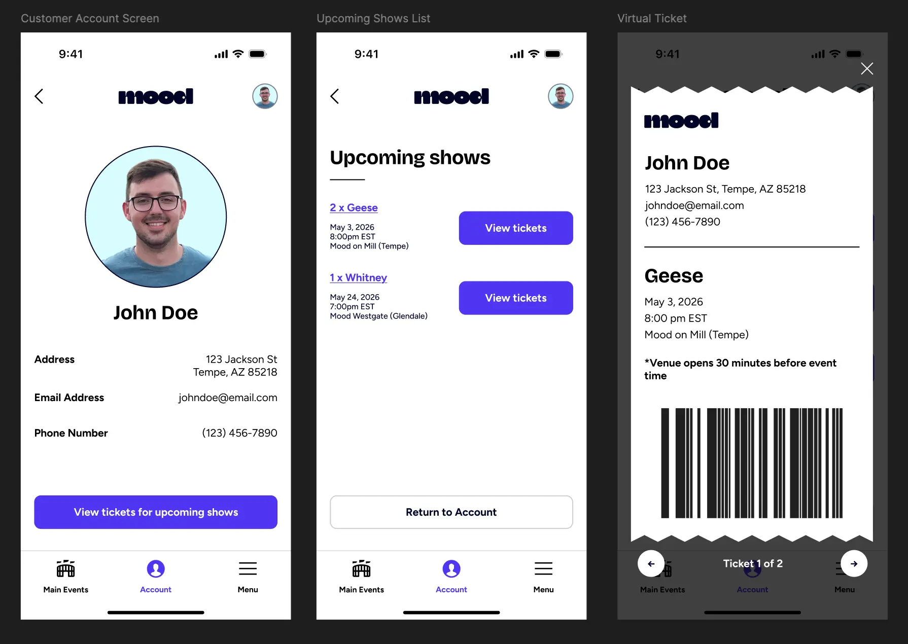
Prior to hiring me, there was no existing online ticket purchase experience - tickets were only sold in-person at each venue. The owner Chris was looking to change this and streamline the process for customers to purchase tickets on their mobile devices. Additionally, Chris wanted customers to be able to pull up their purchased tickets to be able to quickly enter the show they were attending.
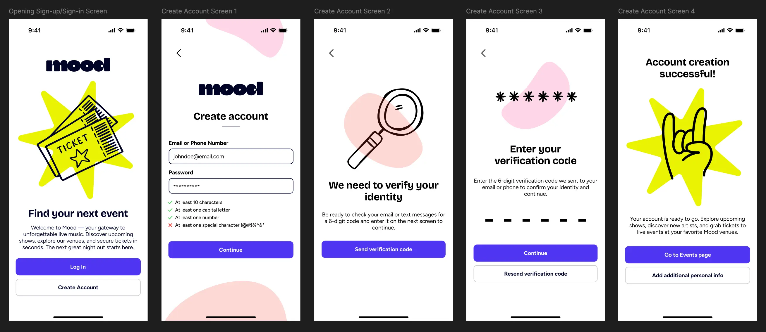
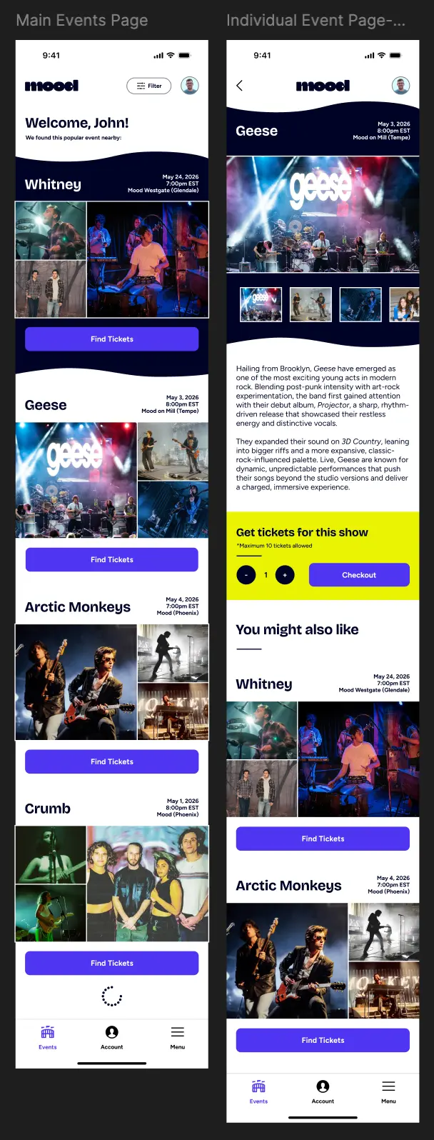
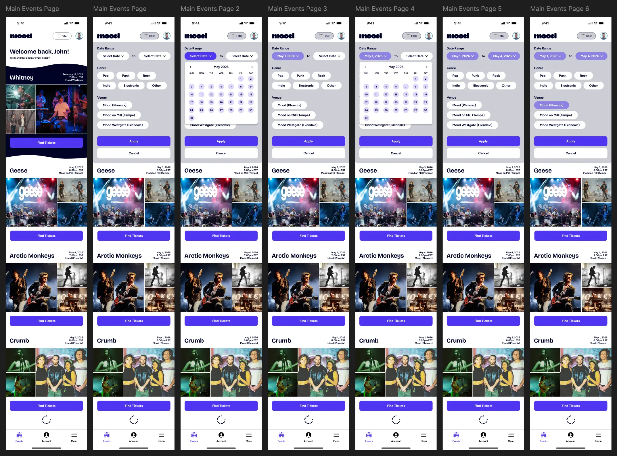
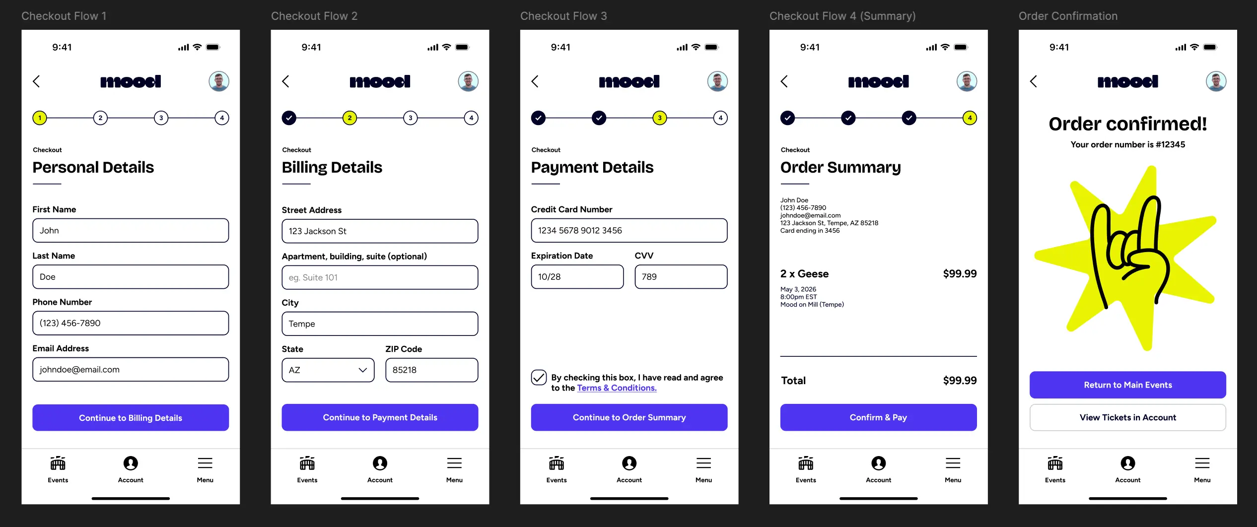
The design solution was a streamlined app experience consisting of an user sign-up/log-in flow, a main events hub with filtering functionality, a checkout flow and a customer account section including a virtual ticket feature that can be accessed prior to the show.
Two user personas were provided for Mood, which helps visualize Mood's core customer base. The first persona, Mike, was a middle-aged engineer who prioritizes leisure and would like to see an app with a solid user experience and ticketing capability. The second persona, Lucinda, was a younger business analyst and graduate student who is looking to escape the stressors of work and school and have a fun experience at Mood. She is looking for a way to share events with her friends and easily purchase tickets online.
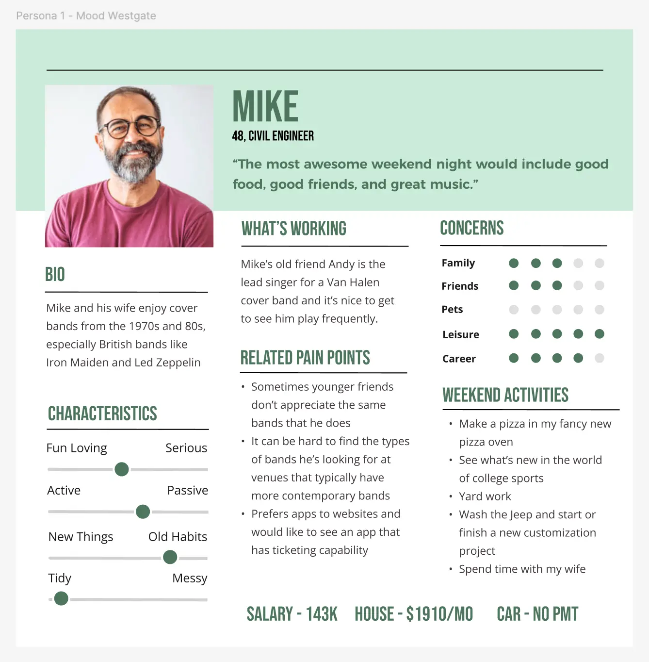
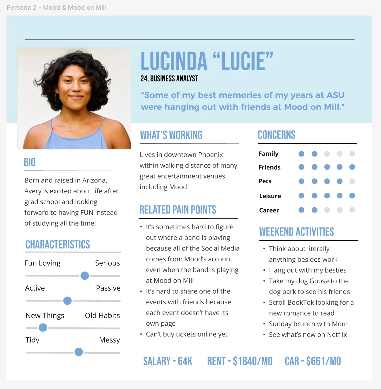
These personas were valuable for allowing me to quickly understand who I was designing the experience for, and what features they were seeking.
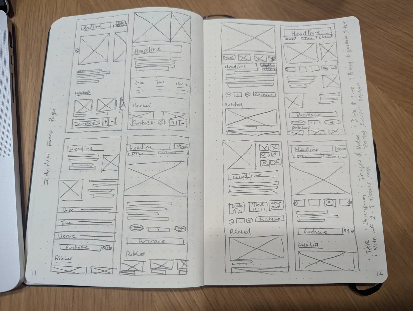
To kickstart ideation, I conducted a "crazy eights" ideation session for what I believed to be the most important page of the app, the individual event page. This page needed to display all details about an upcoming event, as well as provide a method for the user to purchase tickets. A "crazy eights" ideation session consists of rapidly sketching 8 page layouts in 8 minutes.
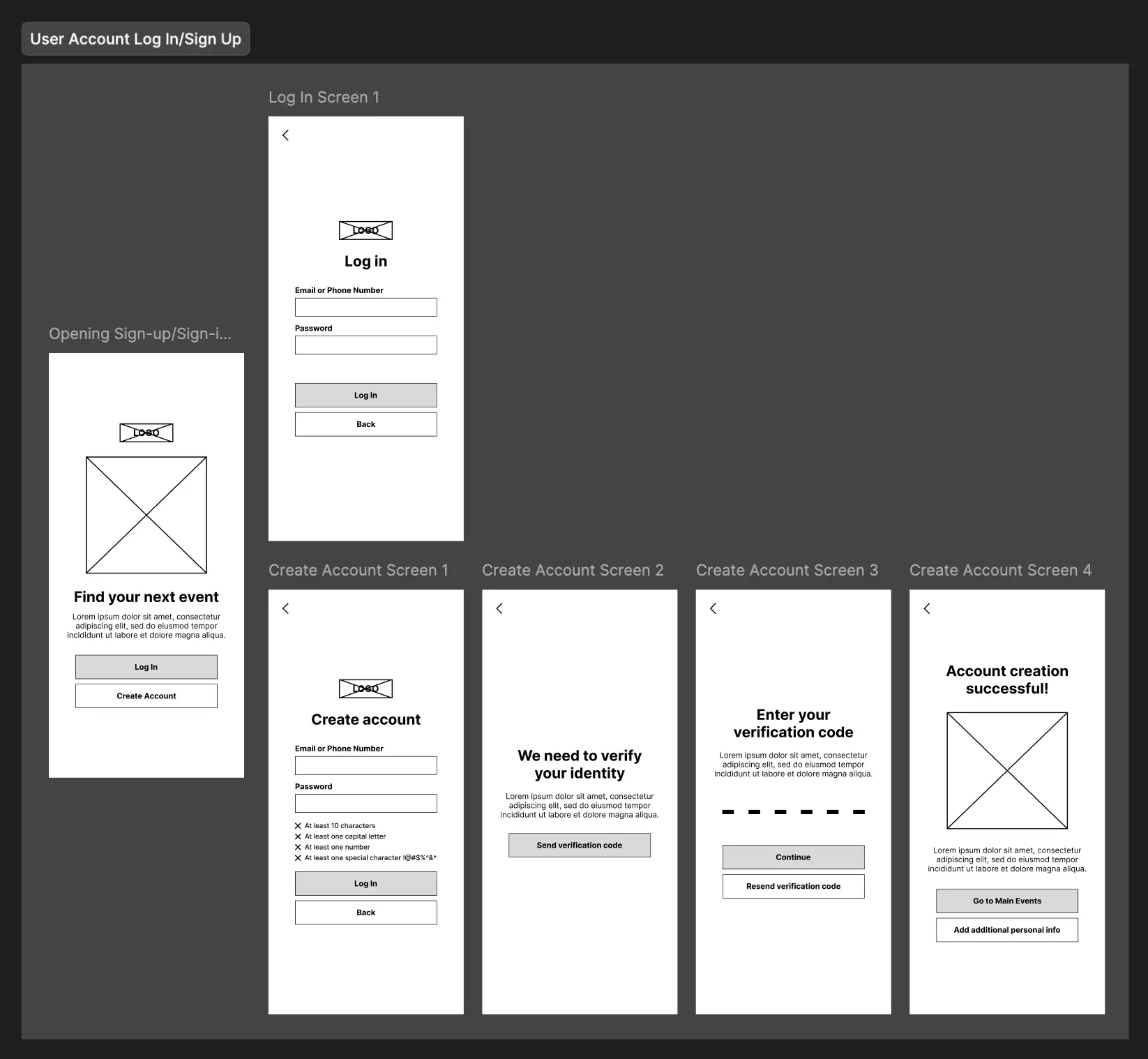
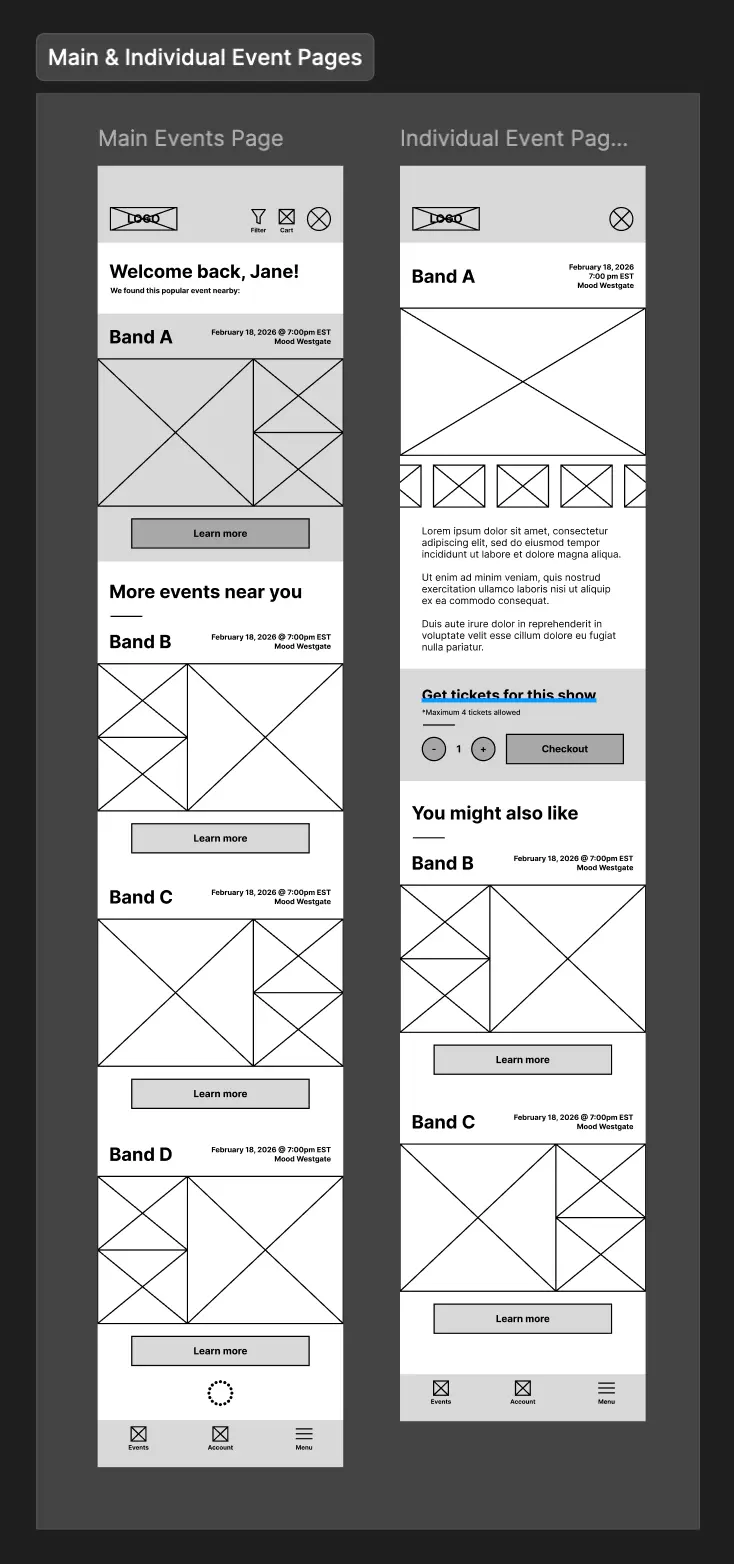
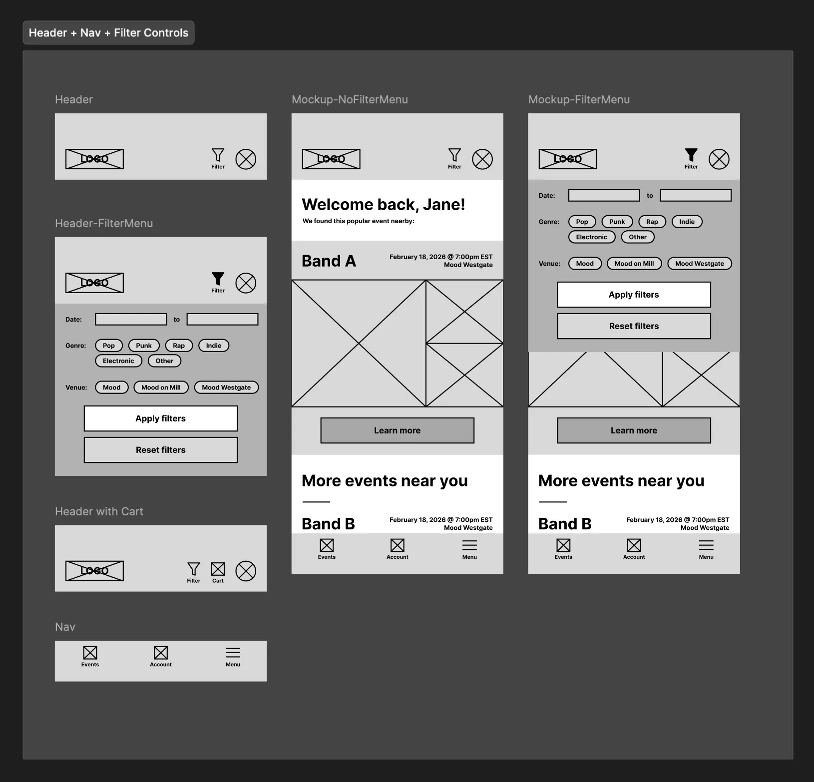
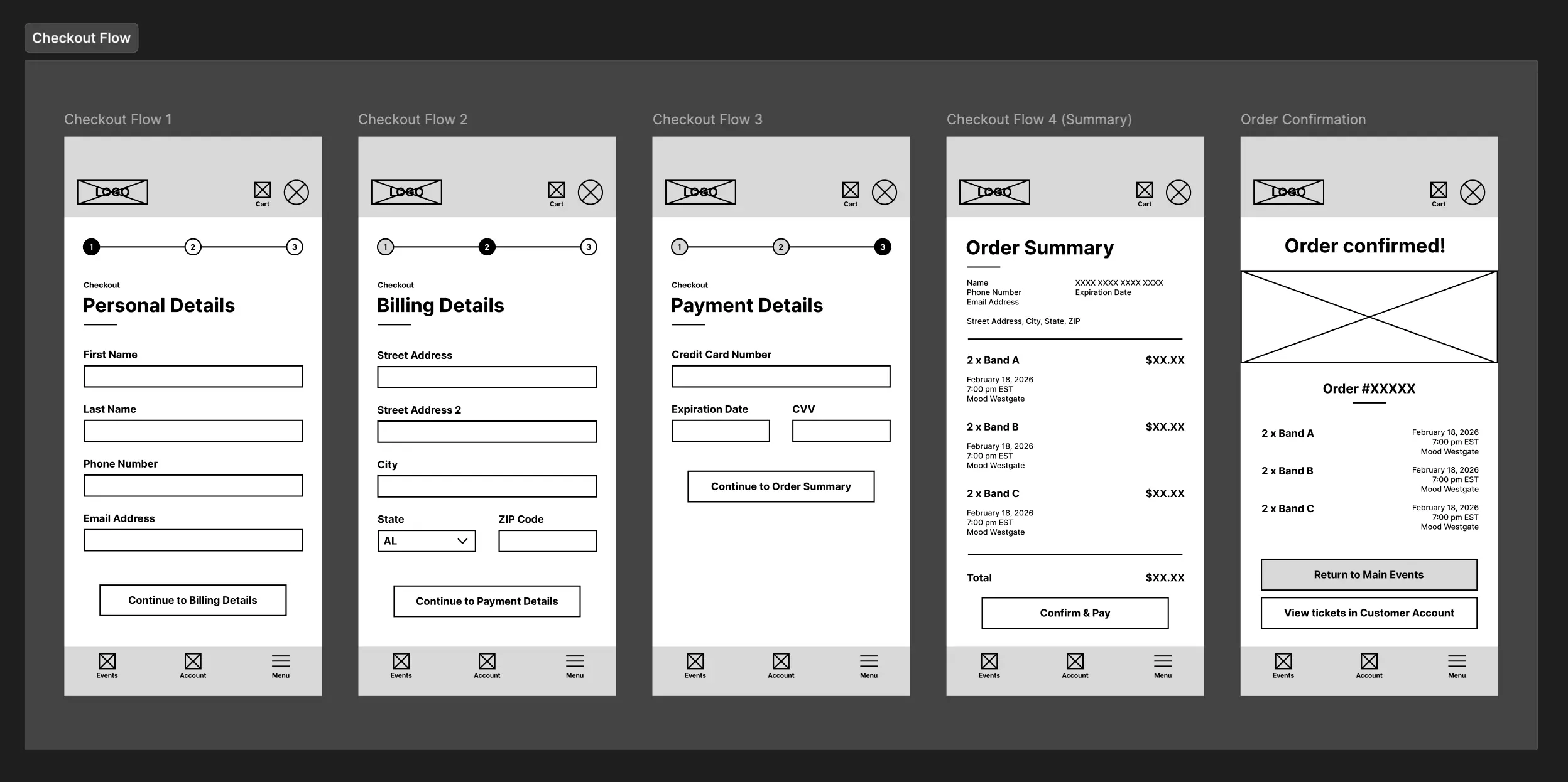
After ideating, I created wireframes for all of the requested screens; for the user account log-in/sign-up flow, the main event page, the filter functionality on the main event page, the individual event page, the checkout flow and the customer account.
After receiving approval for the screen layouts, I moved into designing the high fidelity screens and functional prototype.
You can find interactive prototype links for four different flows throughout the app below:
- Flow 1 (Onboarding to Individual Event Page): https://tinyurl.com/35ucbf6v
- Flow 2 (Filter Functionality): https://tinyurl.com/56t3ub87
- Flow 3 (Log In, Select Tickets & Checkout): https://tinyurl.com/yr9h2bk2
- Flow 4 (Log In & Find Virtual Ticket): https://tinyurl.com/2ztr27j2
Throughout this project, I learned how to properly utilize creative inspiration in regards to UI design through resources like Mobbin and Pinterest.
I also learned how to properly present different features by prototyping different example flows; for example, creating the flow to showcase the filter functionality on the main event page was insightful, as it would be difficult to accurately portray how a particular feature would work to stakeholders without such a prototype.
Lastly, I learned about different UX design patterns and what makes them effective, like adding a "progress bar" within a checkout flow to give feedback to the user about where they are within the process. Quality of life elements like that really go a long way in improving a user's experience.
Given that this was an academic assignment for a fictional company, there weren't many opportunities to conduct research on actual users. The user personas went a long way in helping me understand the target audience, but if I were to start the project again from scratch, I would perform a competitive analysis on similar apps, like Ticketmaster. Doing this would allow me to see what they do right, and would perhaps influence my design.
In terms of the design, I'm happy with how it turned out, but if I were to revisit it, I would likely redesign the layout of the main events page. I don't feel like an "endless scroll" of events does an effective job at showing how many different events there are in total. At a bare minimum, I would add text somewhere on the screen revealing how many total events there are for a given set of filter parameters.
Finally, while I like the aesthetic of the design, I feel it leans more toward the youthful persona of Lucinda and less toward the older persona Mike. If I were to revisit this, I would redesign the look and feel of the app to seem less targeted toward a young demographic and style it to be more universal.
Figma File: https://tinyurl.com/574rwbxn
